
Project: App design
Client: Tonic / Candence
Agency: Furthermore
What I worked on: Concept, User experience, User research, User testing, Interaction design & Visual design.
A group of physicians from the USA came to Furthermore with a start-up idea that they believed could serve a gap in the market. They wanted to create an app that provided on demand, patient-led health and wellness information through actionable insights to provide opportunities for individuals to improve their health and wellness.
The nature of the team and project meant we needed to work in a highly collaborative manner but fully remote with a time difference of +5 hours. All that existed at the start of the process was the beginnings of an idea, a logo and team who believed.
Through thorough research and collaborative workshops we created an app that was easy to use, offered trusted expertise and daily tips and tricks to help users live a healthier and happier life.
THE PROCESS
Lots of brands struggle to create meaningful differentiation and engagement, and those who are able to identify customers’ expectations and address them via authentic emotional values are the ones who succeed. We realised quickly that to do so we needed to talk to the platform’s potential future users.
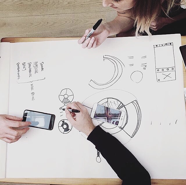
We carried out extensive desk research as well as face-to-face user testing in the UK and online user testing in the US and Canada which fed into the next user experience and design sprints. Within each sprint we sketched, designed, prototyped and tested our ideas with users. Findings from one sprint were always fed into the next and we pivoted and tweaked the product until we had something that really resegnated with the audience.
Some of the insights we uncovered included that the trend of self diagnosis online wasn’t going away and the American health-care system is so complicated (& lets be honest, expensive) so that patients were avoiding going to the doctor at all costs and if they did go, they were spending a significant amount of time researching physicians online beforehand. With smartphones overtaking laptops as the most popular device for getting online and transforming the way we communicate, creating an easy-to-use app in a health market saturated with awful mHealth applications was the right way to go.
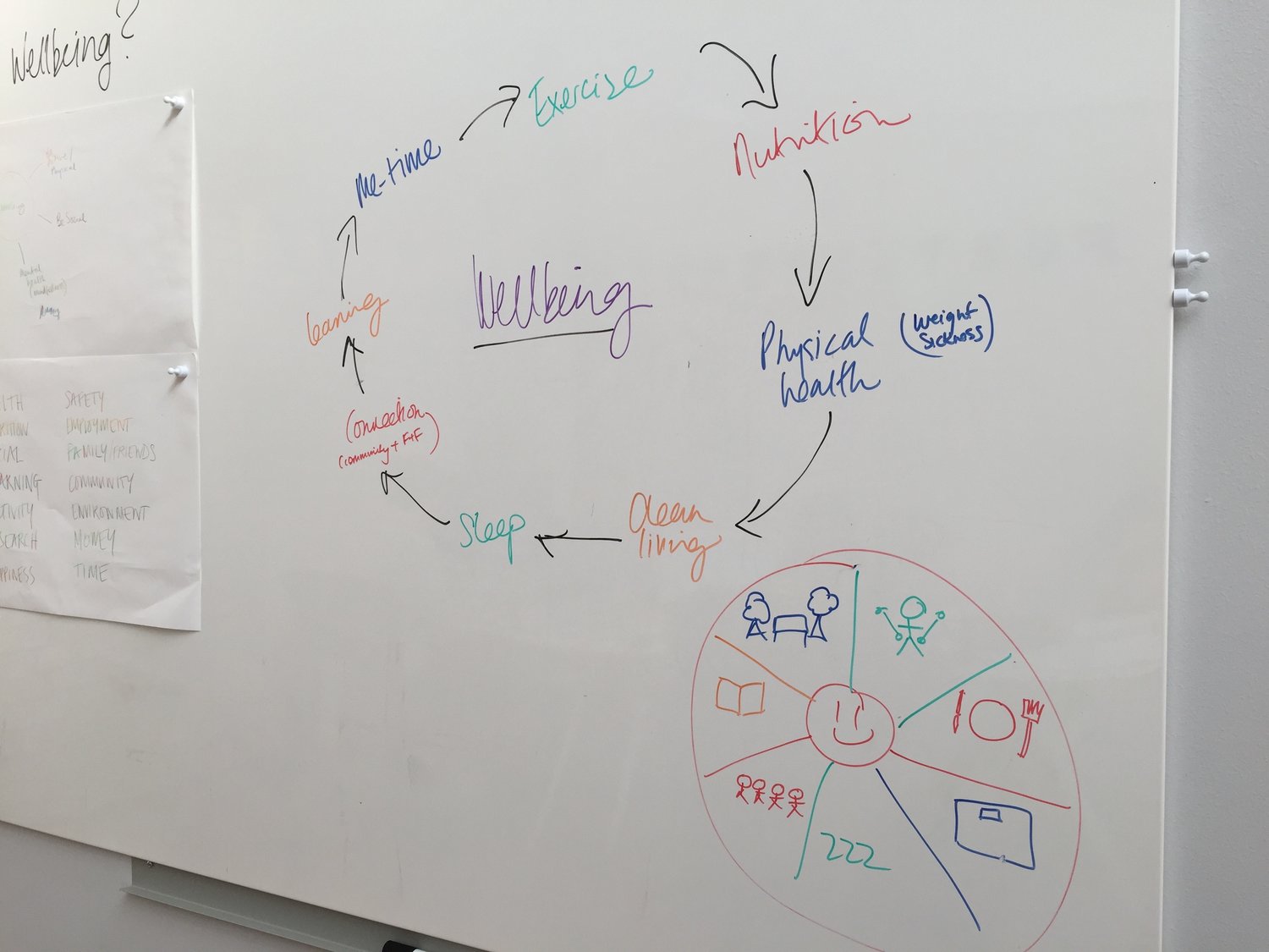
Another interesting element was the trend for medical or health interventions to only consider the physical symptoms suffered by patients. So we looked at a “wheel of wellbeing” which looked to address actionable insights for holistic patient-led health and wellness management. This also helped to inform the content strategy which was an important part of ensuring the success of the project. The fact is that there is a huge amount of mostly useless health information out there, and there is an increasing need to help users “cut through the bullshit”.
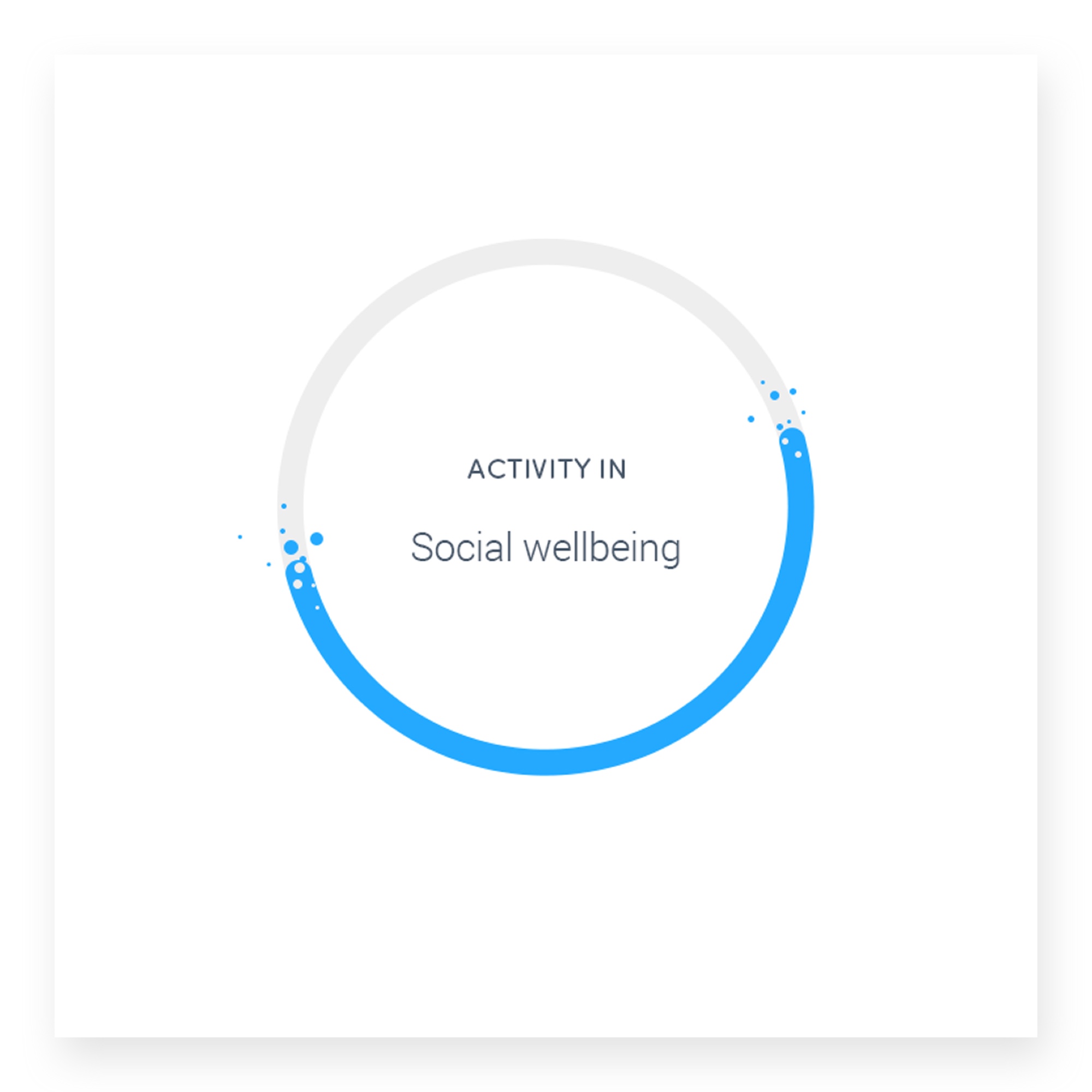
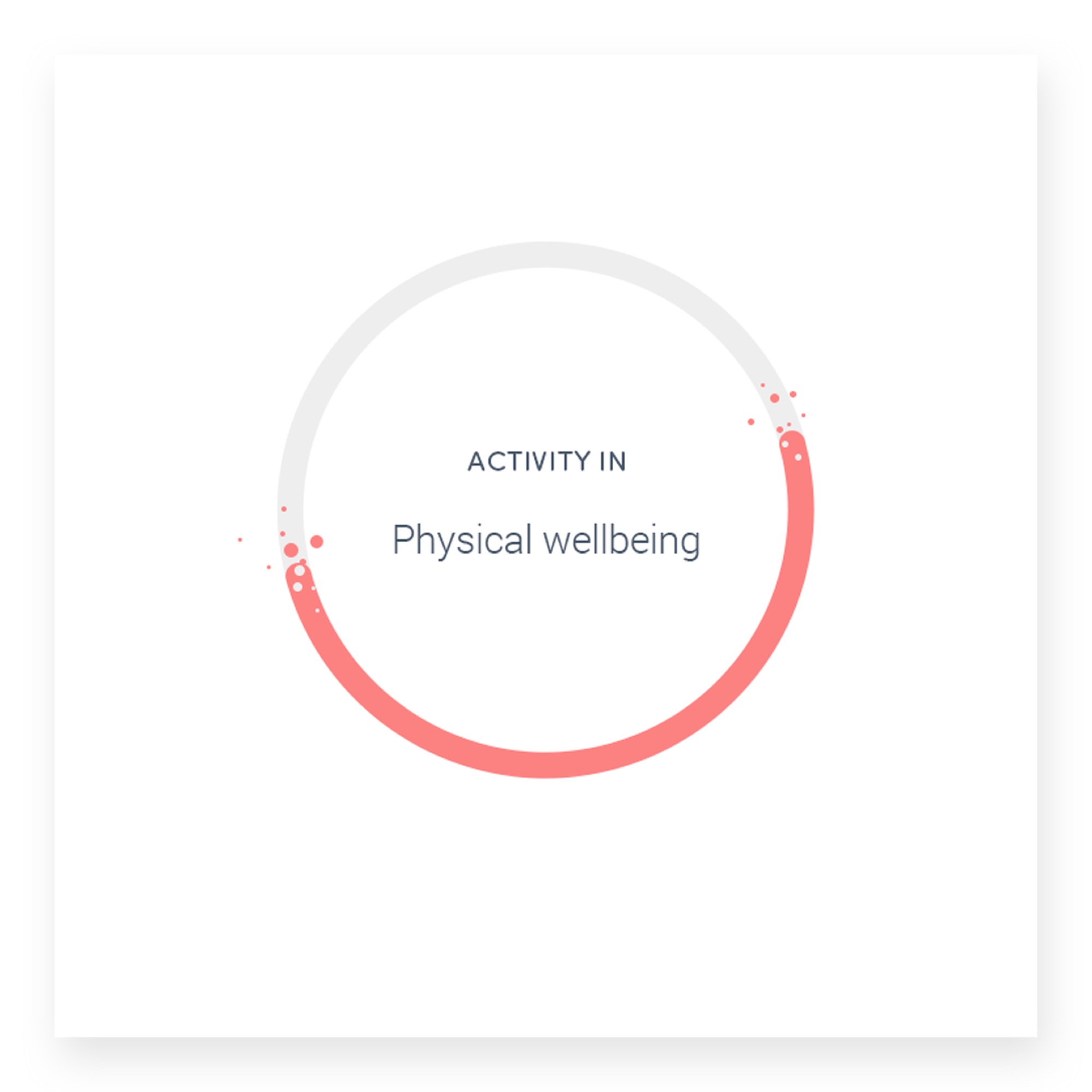
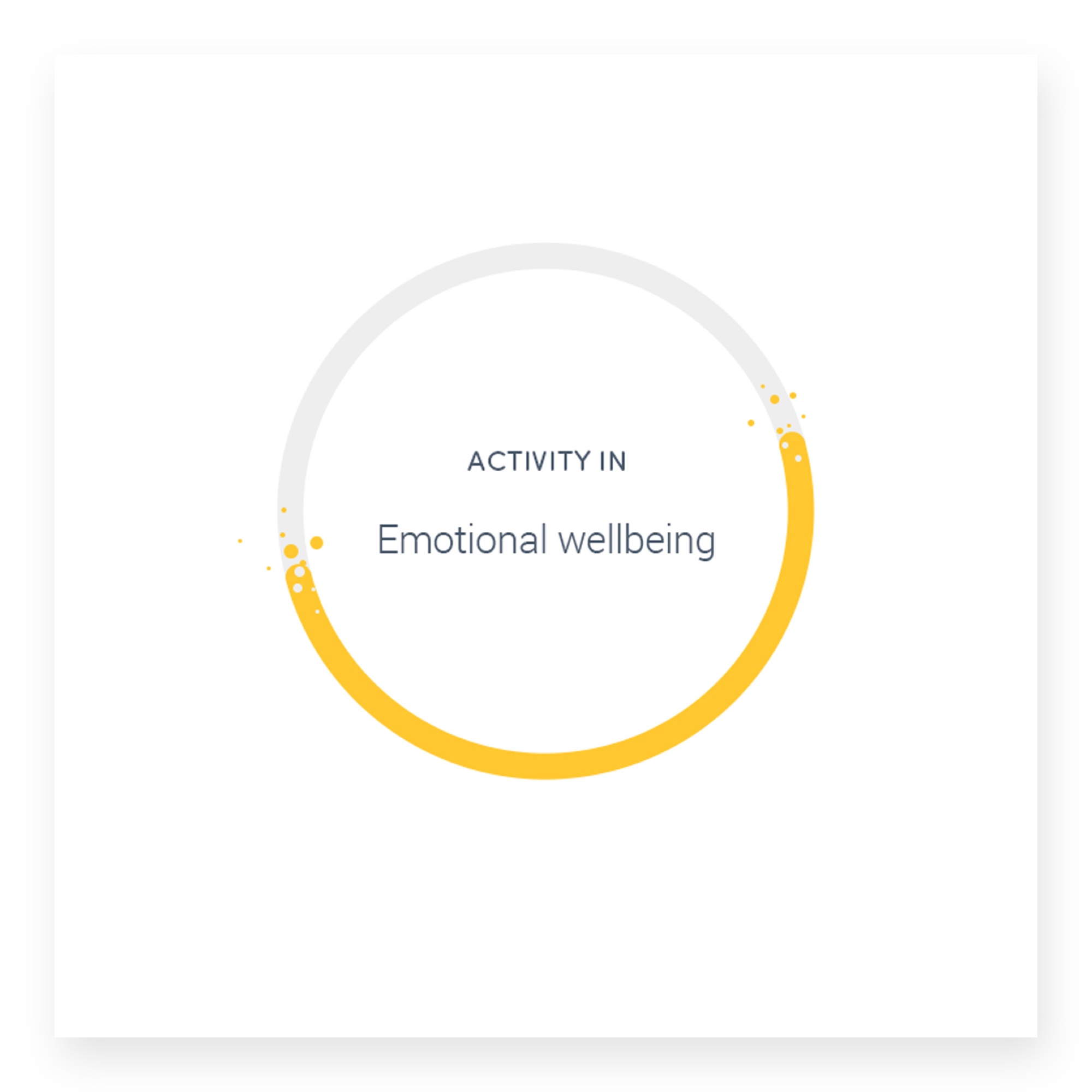
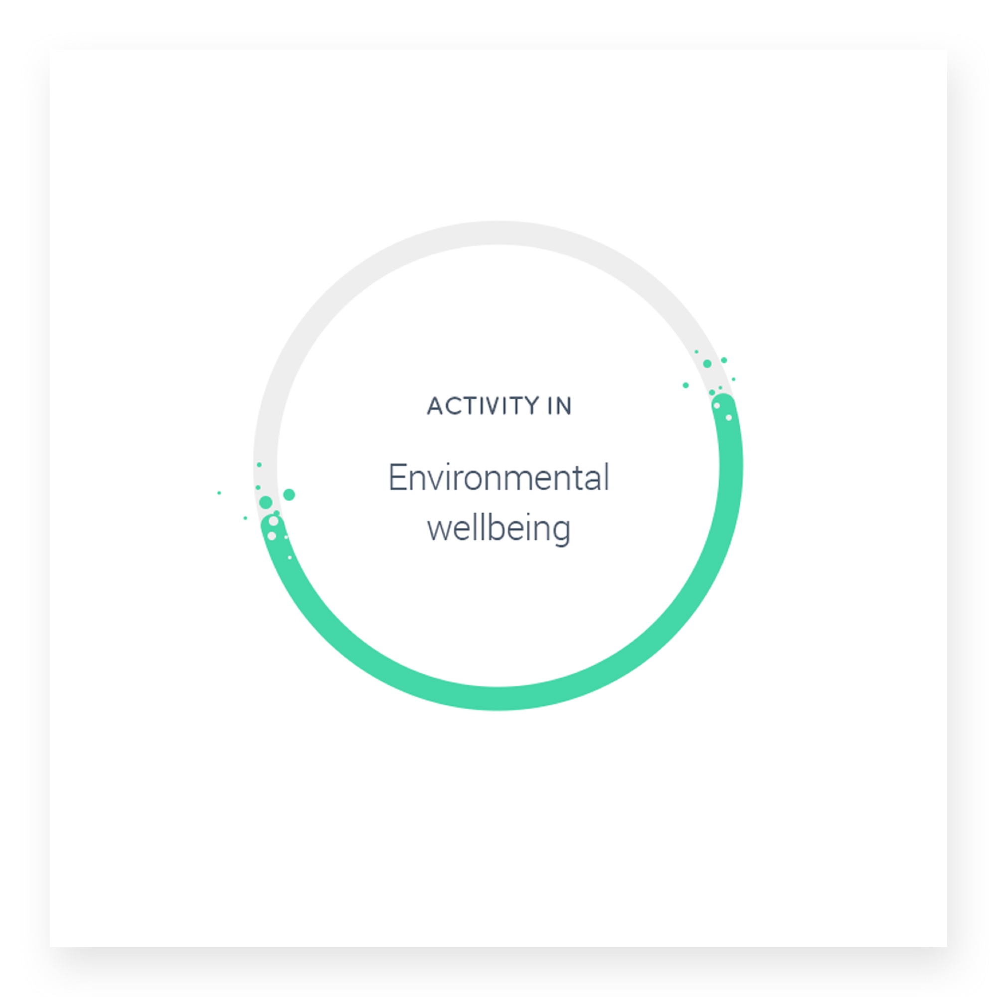
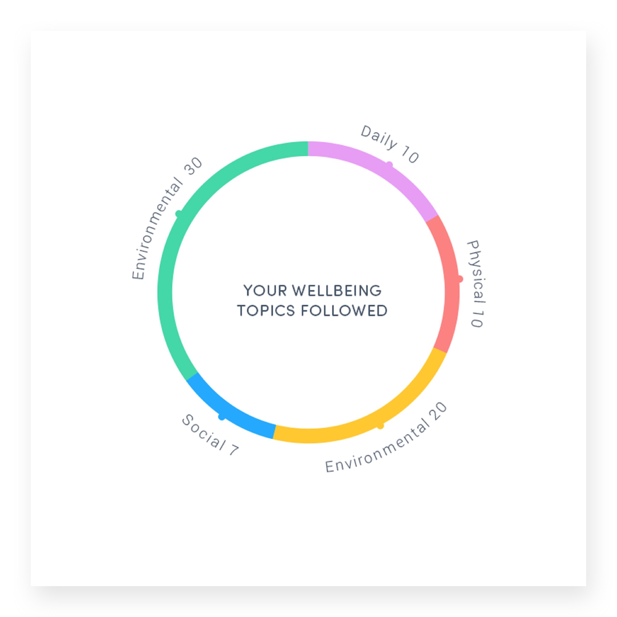
We looked at Nutritional health, social connectedness, education, physical activity, mood and mental well-being, the feelings of safety, employment and self-worth, friends and family, money and of course, time. All of these sections is what we believe needs to be balanced and looked after for a person to feel and be healthy and happy.
THE RESULT
Our concept envisioning phase realised a brand new health app which analyses behaviour and real-time data to provide patient-led care. Customer data and insight is core to an organisation’s successful communication with its users so we worked with the client team to define the types of algorithims that could turn the right data into effective and relevant actionable insights, easy-to-understand resources, tips and tricks to enable the users to manage their own and their families health and wellness and particular diseases such as Obesity, Asthma, mental health issues amongst others.
We created a very simple UI and inviting brand guidelines that is positively addictive and rewards you for getting out and about and taking part. A notifications strategy was core to the idea, i.e. asthma sufferers getting morning alerts on high-pollution or foggy days.

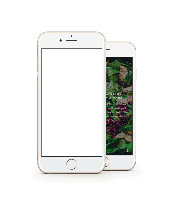
Selection of screens.
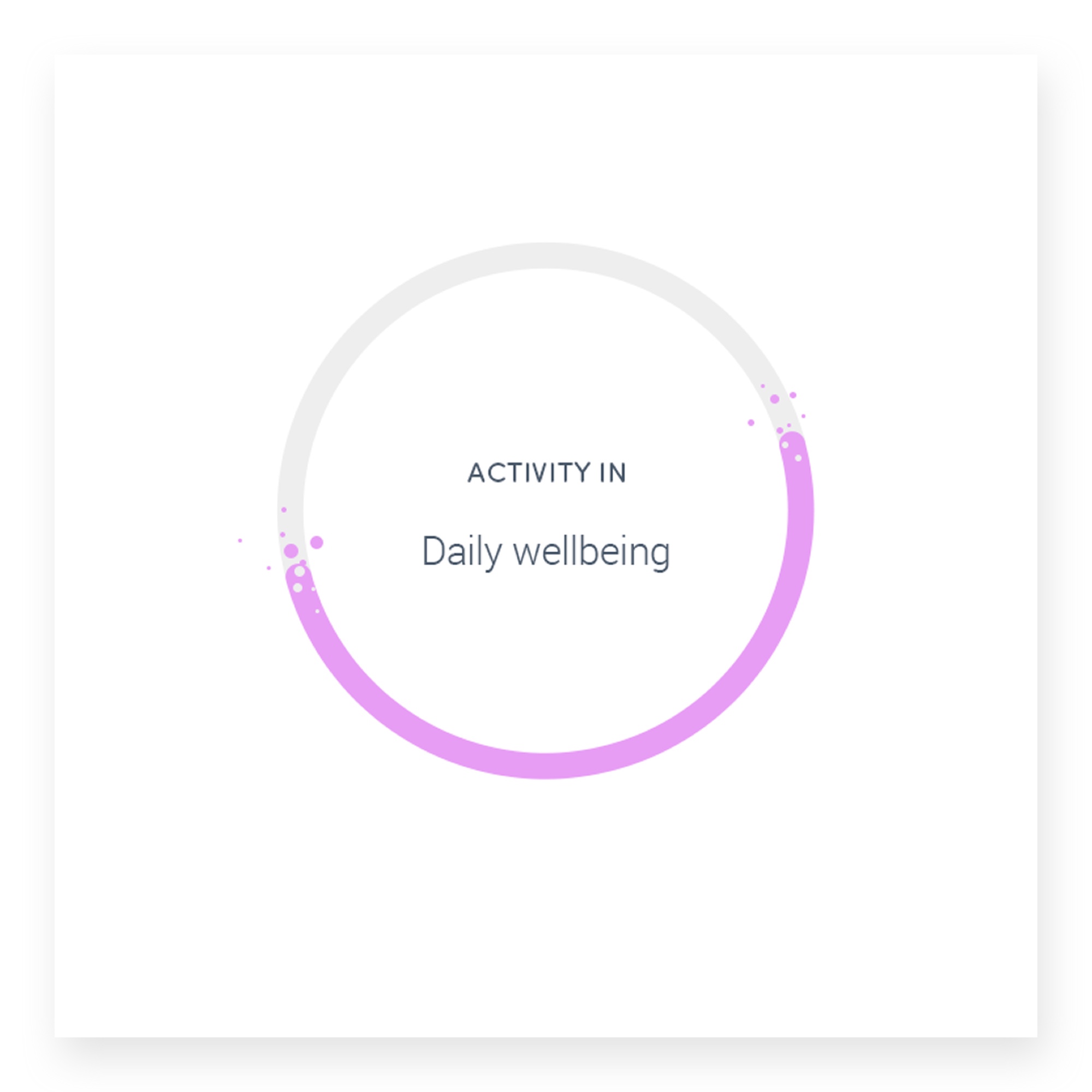
We designed out recommendations on content to improve your holistic health were provided through status wheels, encouraged users to engage with wider topics to ensure a “well-rounded” improvement to overall wellbeing. Content was surfaced in easily digestible and bite-sized cards, swipeable and notifying you each day of your 5 things to work on - if nothing else - called a daily dose of wellbeing.

Branding guidelines
The app is currently in development by the Tonic’s internal team.